Wednesday, April 25, 2012

Photo Journal #1 - J. Liebman


After our visit to the museum I find myself focusing on a few different elements of the space and the conditions that will be a factor for future design. The obvious of those factors were those pointed out by the staff.  Some of the considerations I noted were: the display must be highly adaptable, the display will be for events that mix history with contemporary society, the information should be a combination of both schedule and way finding, create flexible seating areas, serve as a method of separating crowds, and it must not necessarily overpower the exhibits. 


  In terms of the physical qualities a few things spoke out to me.  One of the first things I noticed was the juxtaposition of historic and modern materials, for example the old wooden elevator door directly next to a heavy modern steel door for the children’s area.  That seems to be a common theme throughout the entire museum so I think that should be a large part of how we begin to conceptualize materiality.  Another standout for me was patterns and geometry.  Nearly every piece of material in the building had embedded complex geometries, which can also begin to inform the derivations of our structure.


          Just a few other notes that were in my head, because the summer exhibits are based around tapestries I think we can take advantage of that and design some kind spatial fabric network that can also serve as a method of way finding.  Also I remember the staff mentioning the disliked the fountain in the middle of the lobby so If we could find a way to maybe hide or diminish the presence of the fountain the design could be well received. 


The first display that I chose was a map for the London underground.  This may not be a multifunctional display, but I chose it because of the manner in which it conveys the information.  The map cannot rely typical methods for way finding at street level so they developed there own graphical representation that can convey to patrons exactly what line and stop they need to be on.


The next display I chose is the Vietnam Memorial in Washington DC.  It displays several scales of information, at its smallest, the individual names, at its largest, the massive amount of lives lost in the war.  The way it is designed naturally progresses people along a path and the gradual slope gives patrons a sense of scale in terms of the amount of loss.


The next idea that I figured might be worth pursuing is the use of smartphones.  A large percentage of partrons are likely to have smartphones, this allows for the potential of interactive use of our display between the built and digital environment.  Also, turn by turn directions could be provided.  Haha


Reading Response - Josh Liebman


As a society we have always tried to understand the meaning of what we create and accomplish.  It is my take that we often look past the most obvious connections in a search for deeper meanings.  I was particularly taken by the section of McLuhan’s writing were he began to discuss IBM and AT&T.  We often look at them as either a computer chip company or a phone company, however IBM is in the business of processing information and AT&T is in the business of transferring it.  Going back many years, the birth of technology came from the need for tools, to aid us in what our bodies could not accomplish.  Now, with technology growing exponentially, the argument is made that technology is now extensions of our bodies.  A few questions that we could ask a large majority in the country I would assume to yield the same answers.  What would you do without a cell phone? Car? Computer? 
            Another part of the argument is to consider how we actually view or perceive these “tools”.  The example used in McLuhan’s writing says that such objects or things like firearms or smallpox are not good or bad when viewed as only an object.  Our perception changes when they are used or affected by society.  The physical gun itself does not necessarily create violence, however it reflects a societies message, that being one of violence or potentially something else, depending on where that message is coming from.  ( i.e. we view war and inner city violence very differently) 
            The point of all this to me is that we use these objects or creations all as means of expressing ourselves.  Yes we need light bulbs to keep our home lit at night, but what kind of message or environment can you create with the light bulbs you choose to put in your home?  Are they colored or tailored to give off a certain affect?  Are they CFL’s? Why do we customize our phone cases?  All these questions reflect the very nature of why create almost everything that we do as a society, so as designers, when we approach a new project, we often task ourselves with making the architecture communicate the clients’, or societies wants/needs/feelings and so on.  

Jbasler photo journal #1


There were a few things that I took note of on the site visit. I have visited the museum before, so I was somewhat familiar with the layout and the spaces.
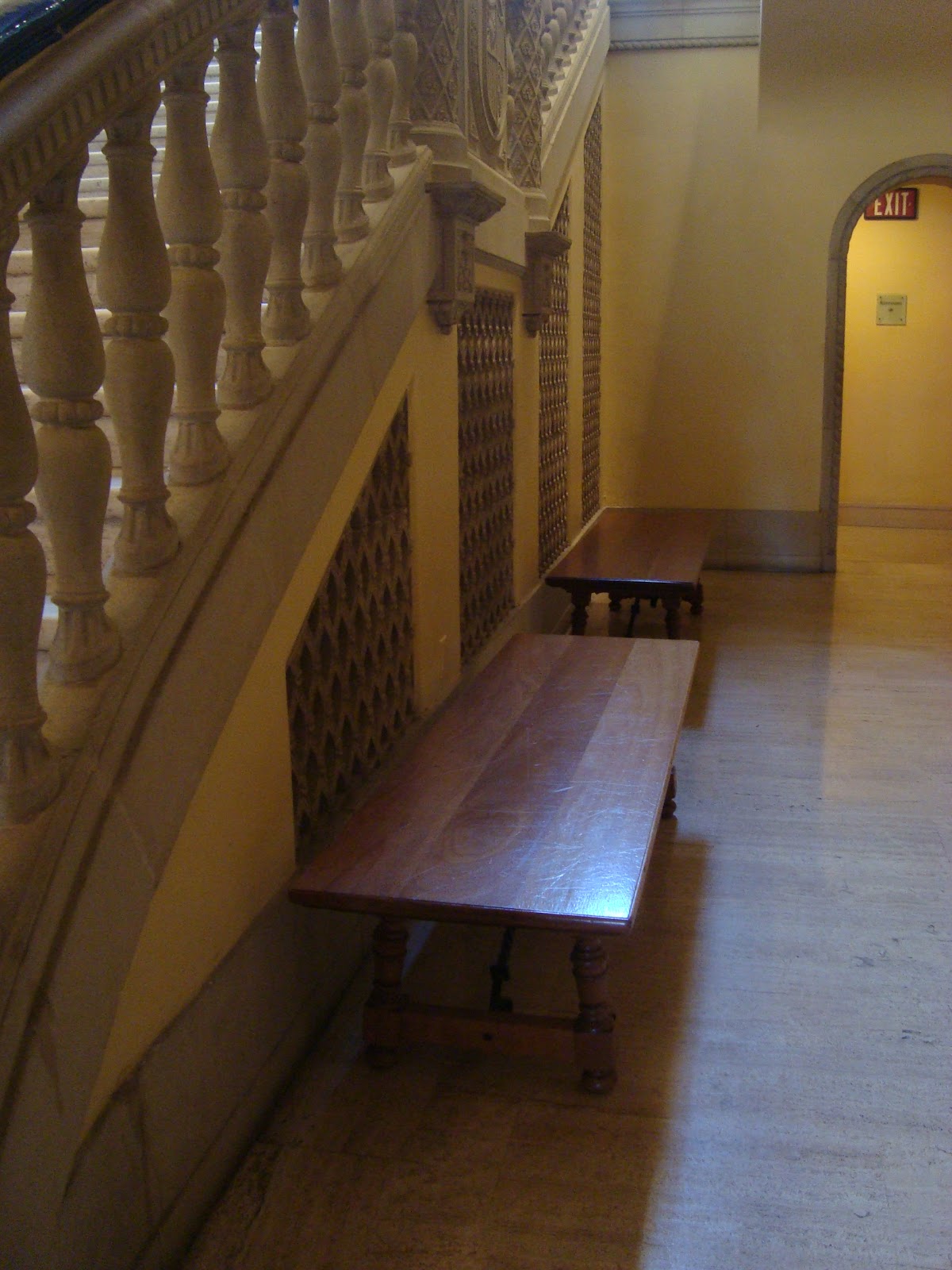
I utilized the time to look more in depth at some of the logistical opportunities including the areas under the stairs. There appear to be cavities behind the screen elements under the stair. I don’t yet know if this is a space that we can or want to use, but it caught my eye.
I also spent some time looking at the opportunities to utilize the floor space directly above the floor. One of the images that immediately came to mind was the opportunity to wrap the entire floor and project from behind. As much as I hate most of his work, Christo’s work came to mind.
The fountain also seems like a logical base or placement for an installation as it is the only immovable piece in the central entrance area. However much the museum may not like the permanence of the fountain, it does bring an odd sense of nostalgia for a time when museum architecture didn’t just focus on the flexibility of spaces.
The images below are things that have caught my eye that are relevant to this discussion.
The first is Christo’s wrapped palace. It’s is at a much larger scale than we are working with, but it offers an opportunity for rear projection that I mentioned above.


Christo


Second is the interactive façade at Variate Labs in L.A. it responds to the people walking by and can display information that is unique to the walker.


Variate Labs


Third is a photo of the interactive floor projections that we might find at fashion valley or other malls. The ones I have seen are games that kids can play with when they get bored of shopping with their parents.


Interactive Projections


Fourth is a fog display screen. I initially thought this could be a great technology to utilize, however I then started thinking about humidity and artwork……

Fog Screen Projections


Lastly is a sculpture that is outside my office down at glashaus. It is a sculpture of the soundwave of the description of the piece. The resulting sculpture is self-descriptive and interesting in that regard.


Matt Devine's 
387 5/8" Steel Rods


Saturday, April 21, 2012

Museum Visit


On our site visit, I noticed that the museum space has a few obvious empty wall and floor spaces that provide good opportunity. The panoramic photo displays the central space, while the other photos of the space depict opportunities. Small seating areas are aligned with the grand stair, but are not utilized often, therefore, there’s a definite need for more seating within our design.
I also took photos of unique moments or items within the museum that inspire thoughts/ideas for our design. I thought the fake skylight illuminating the lobby rotunda area was quite funny, although not many people would notice something like this-I like the idea of creating a fake environmental condition that allows for more occupant control and/or in a setting where this naturally would not be possible. I also started looking at the frames on each painting, noticing how each was unique and either added something to the painting itself or blended into the background to not take any attention away from the art itself. The manner in which the art is displayed, the lighting, the frame, even the color of the wall -these are all factors to take into account when displaying something within the museum. Each environment/setting is unique to the art being displayed. The last photo of artwork in the museum was a painting displayed on tiles which I really loved because it goes along with our theme of looking at different mediums to use when conveying a message. These tiles in particular were placed in domestic settings in everyday life.
The examples of information displays or creative art pieces start with the new airport desks for JetBlue. The text is used to create a decorative pattern behind the workers which also conveying their motto or company goals. The second photo is a sofa store in Germany where the windows and lighting and other furniture items are cutouts in the wall so our attention is placed on the sofas since they are the only physical item in the rooms. The next photo is from a shoe store, which I liked the unique way they displayed the shoes creating a unique environment/interaction to the products as well. The Californian flag is a three dimensional representation for a storefront, while the photo below it is a storefront that took brown paper bags of different shapes and sizes and reconstructed them to look like a city. The final photo displays a unique way of applying text through the density and weaving of thread over nails, this makes the text or message a piece of artwork in itself.