I can’t help but feel that exploring
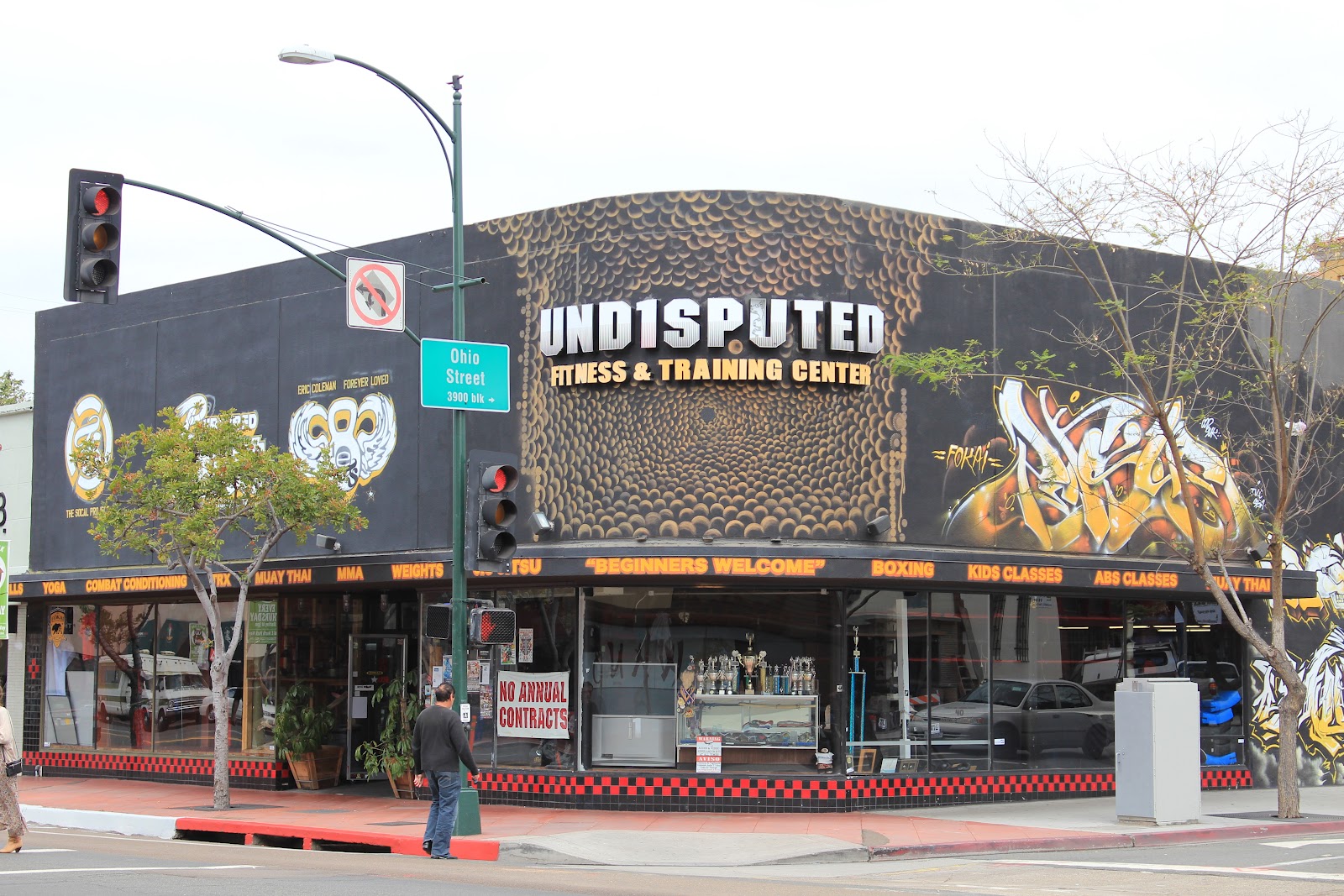
Horton Plaza was good example of what not to do when approaching design. In my opinion the space is not
comfortable, terribly hard to navigate, and a mess of styles. When approaching our design for the
information display, the language should be clear and speak to a character that
we decide, as well as aid in navigating.
I found it difficult to find qualities worth taking away amidst all the
advertisements and the dizzying maze of pathways.
What
really stuck out to me was the juxtaposition of style. Much of the buildings were painted and
treated like post modern structures, yet the main clock and lamps have an
art-deco style, and I’m not even sure how to classify the obelisk. Then when you get to the food court it
becomes a free for all with each store attempting create their own
environment.
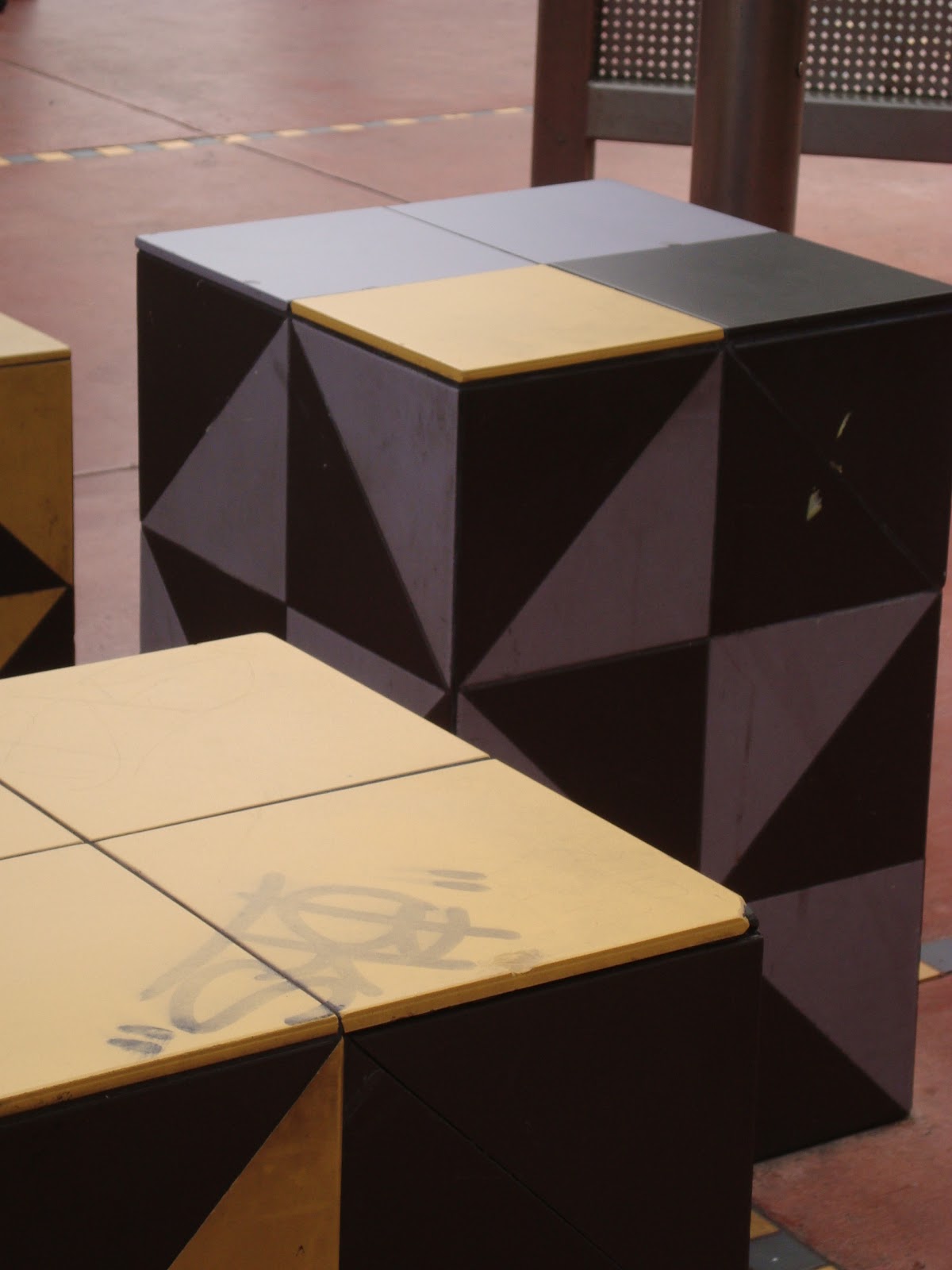
As
for information displays I did find of few interesting moments. I thought some of the display/store
units riddled throughout the mall provided some insight. In one small box, information about the
product, and at the same time contained the product, and mitigated the sales of
the items as well. Some other
things I noticed were information put on the ground. Just outside the mall a manhole cover have the Gaslamp
Quarter logo on it, signifying the neighborhood you were in. There were strips of tape along
walkways in the mall to signify changes in the floor height, and there were
advertisements on the ground as well.
I
also found it interesting that people tended to gather in the space that we met
as a class, by the chessboards. I
believe that when interactive elements are provided then people naturally
gravitate towards the opportunities provided. That one space seemed to be the only spot in the
entire mall people decided to stop and gather other than in the stores they
were visiting.


A few of the displays I mentioned before, but another place I visited recently is worth mentioning. The memorial on top of Mt. Soledad is a beautiful place for people to gather, along with displaying the information of soldiers.