


After looking around a bit, I'd realized I have been to this museum before...
guess the artwork is way more memorable than the building. It seems the buildings of Balboa Park-in trying to imitate the Spanish architecture-tend to all look the same. So I went for the details, distinguishing features, and I think wayfinding is up there on my list.
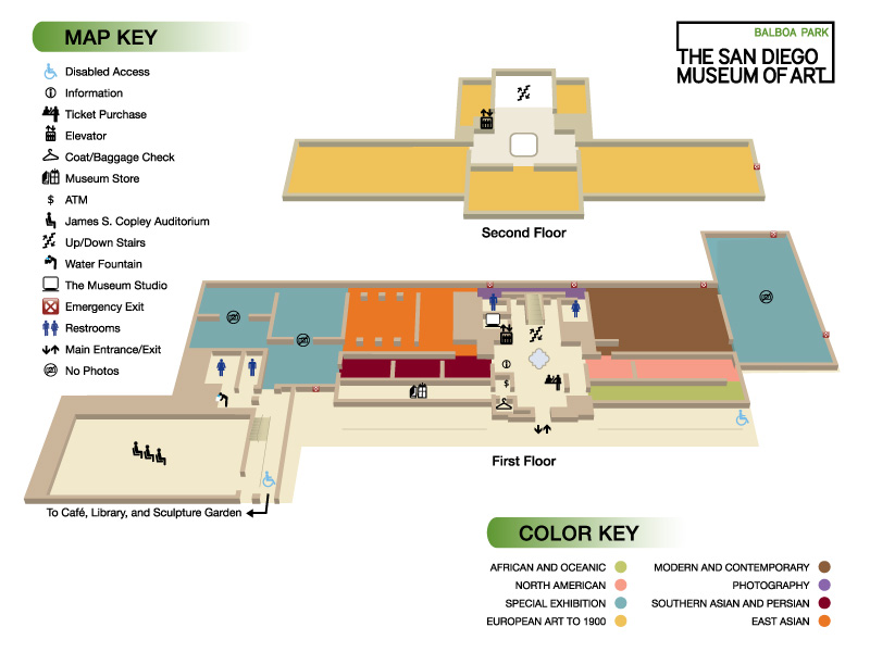
So here's the map. I noticed it tends to stay true to the color key, as far as accent walls in the different exhibits. Also the second floor has a distinctly lighter feel, with the openness, yellowness and lighting. The bottom level felt heavier and darker; materials like marble floors and fixtures being more grand.
I'd like to see if we can incorporate some of this into directionals, or even provide a more intuitive way for visitors to locate events.
 |
| Indonesian Architects, Alur Design 2010 |
No comments:
Post a Comment
Note: Only a member of this blog may post a comment.