


On our site visit, I noticed that the museum space has a few
obvious empty wall and floor spaces that provide good opportunity. The
panoramic photo displays the central space, while the other photos of the space
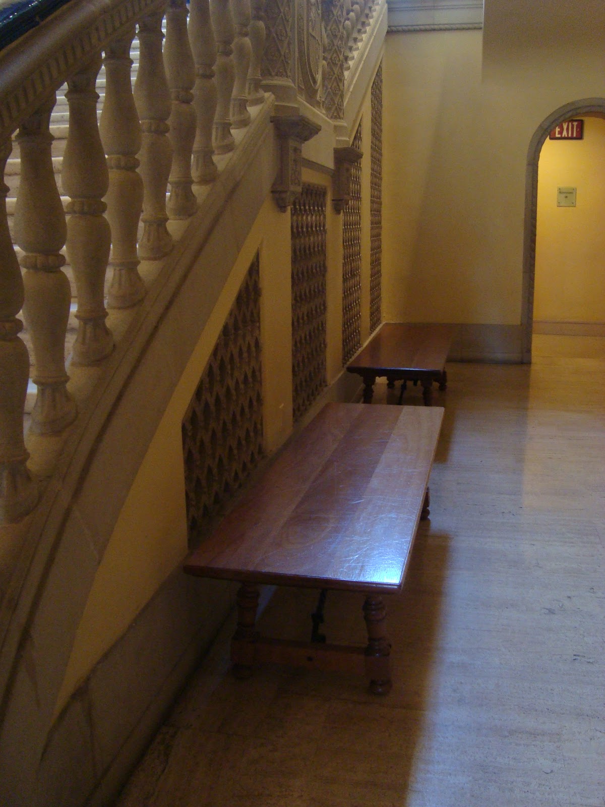
depict opportunities. Small seating areas are aligned with the grand stair, but
are not utilized often, therefore, there’s a definite need for more seating
within our design.
I also took photos of unique moments or items within the
museum that inspire thoughts/ideas for our design. I thought the fake skylight
illuminating the lobby rotunda area was quite funny, although not many people
would notice something like this-I like the idea of creating a fake environmental
condition that allows for more occupant control and/or in a setting where this
naturally would not be possible. I also started looking at the frames on each
painting, noticing how each was unique and either added something to the
painting itself or blended into the background to not take any attention away
from the art itself. The manner in which the art is displayed, the lighting,
the frame, even the color of the wall -these are all factors to take into
account when displaying something within the museum. Each environment/setting
is unique to the art being displayed. The last photo of artwork in the museum
was a painting displayed on tiles which I really loved because it goes along
with our theme of looking at different mediums to use when conveying a message.
These tiles in particular were placed in domestic settings in everyday life.
The examples of information displays or creative art pieces
start with the new airport desks for JetBlue. The text is used to create a
decorative pattern behind the workers which also conveying their motto or
company goals. The second photo is a sofa store in Germany where the windows
and lighting and other furniture items are cutouts in the wall so our attention
is placed on the sofas since they are the only physical item in the rooms. The
next photo is from a shoe store, which I liked the unique way they displayed
the shoes creating a unique environment/interaction to the products as well.
The Californian flag is a three dimensional representation for a storefront,
while the photo below it is a storefront that took brown paper bags of
different shapes and sizes and reconstructed them to look like a city. The
final photo displays a unique way of applying text through the density and
weaving of thread over nails, this makes the text or message a piece of artwork
in itself.
No comments:
Post a Comment
Note: Only a member of this blog may post a comment.