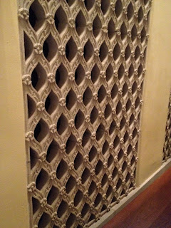
After our visit to the museum I find myself focusing on a few different elements of the space and the conditions that will be a factor for future design. The obvious of those factors were those pointed out by the staff. Some of the considerations I noted were: the display must be highly adaptable, the display will be for events that mix history with contemporary society, the information should be a combination of both schedule and way finding, create flexible seating areas, serve as a method of separating crowds, and it must not necessarily overpower the exhibits.
In terms of the physical qualities a few things spoke out to me. One of the first things I noticed was the juxtaposition of historic and modern materials, for example the old wooden elevator door directly next to a heavy modern steel door for the children’s area. That seems to be a common theme throughout the entire museum so I think that should be a large part of how we begin to conceptualize materiality. Another standout for me was patterns and geometry. Nearly every piece of material in the building had embedded complex geometries, which can also begin to inform the derivations of our structure.
Just
a few other notes that were in my head, because the summer exhibits are based
around tapestries I think we can take advantage of that and design some kind
spatial fabric network that can also serve as a method of way finding. Also I remember the staff mentioning
the disliked the fountain in the middle of the lobby so If we could find a way
to maybe hide or diminish the presence of the fountain the design could be well
received.
The first display that I chose was a map for the London underground. This may not be a multifunctional display, but I chose it because of the manner in which it conveys the information. The map cannot rely typical methods for way finding at street level so they developed there own graphical representation that can convey to patrons exactly what line and stop they need to be on.
The next display I chose is the Vietnam Memorial in Washington DC. It displays several scales of information, at its smallest, the individual names, at its largest, the massive amount of lives lost in the war. The way it is designed naturally progresses people along a path and the gradual slope gives patrons a sense of scale in terms of the amount of loss.
The next idea that I figured might be worth pursuing is the use of smartphones. A large percentage of partrons are likely to have smartphones, this allows for the potential of interactive use of our display between the built and digital environment. Also, turn by turn directions could be provided. Haha


No comments:
Post a Comment
Note: Only a member of this blog may post a comment.