Saturday, April 28, 2012

Horton Plaza Photos

Here is a selection of the photos I shot on our trip to Horton plaza. I just thought I would post what I have too in case it can help facilitate design conversations later on. So far things seem to rolling along with class. In terms of the visit to Horton Plaza I was struck by the sheer volume of information and the stark contrast in design that goes in advertisements versus more utilitarian signage such as the store numbers, safety signs etc. Also I was surprised at how efficiently Macy's employees are at telling people not to shoot photos in the store...

Looking forward to reading your entries. See you next week.

-David


Horton Plaza


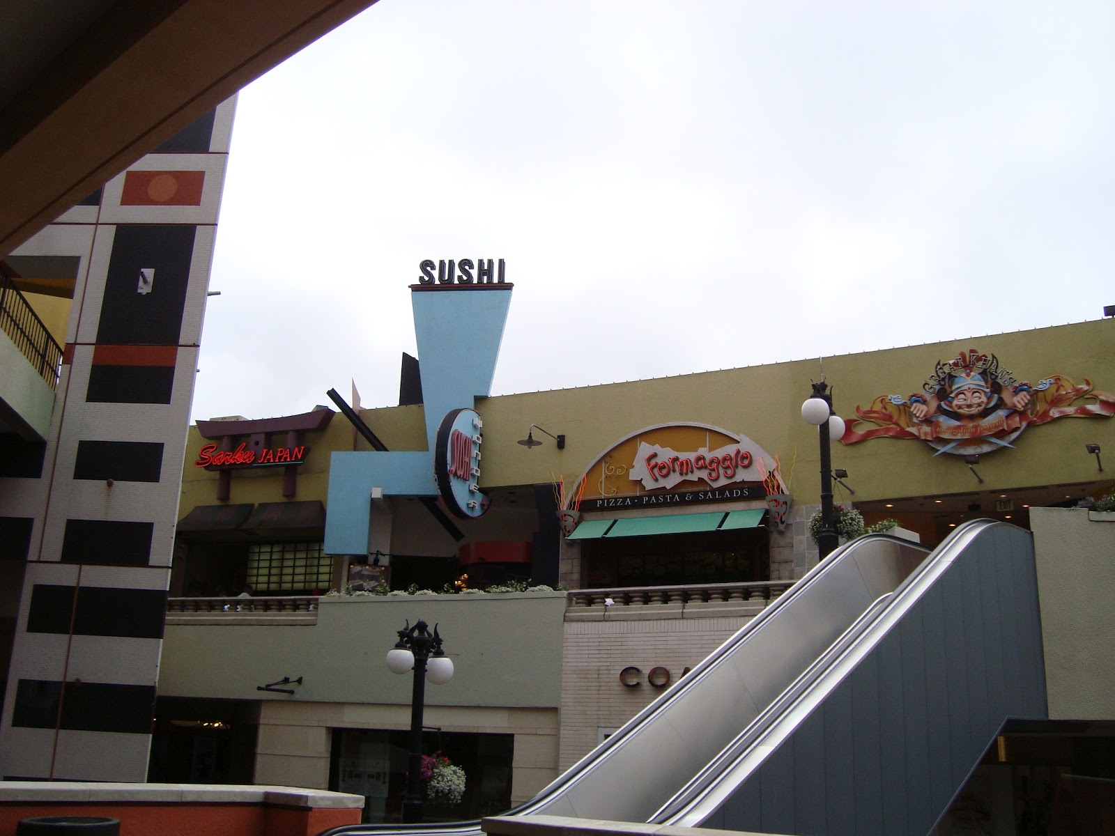
Being at Horton Plaza and observing made me realize the thought and creative side behind the storefront designs. Each have their own material palette which is used as a means of information/communication to the shoppers. Although, it's probably subconscious.. the material palette can convey what's inside and give you a certain preconceived notion for what products they might sell. For example, the sparkles in the blue tile.. they sell jewelry. In the photos that follow you will see other examples of this same pattern. The house of stemms used a more direct, literal approach with actual flowers. Johnston& Murphy chose stone, most likely because they sell men's clothing, and the rough, jagged stone gives a more outdoorsy vibe. Gymboree uses color to indicate that its a kids clothing store. I also noticed that the top level for the food court becomes hard to see from the lower levels. I suspect that the very literal and large size of the signage in all of the food court and top level shops was made that way intentionally due to this issue. The store that sells hats literally has a huge hat as their sign... definitely can't miss that from the lower levels.


After visiting Horton Plaza I started thinking about our installation and what materials are inexpensive, yet make a big impact.. and can be integrated with projections/film and seating. So I started looking at webs with rope and fabrics. They can be stretched to create various forms and can have lights, colors or film projected directly on it, instead of placing it on the wall, this gives us more flexibility in terms of where we choose to place the "screen" or viewing area. 


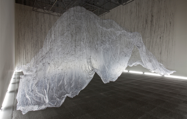
Fabric can bet in tension for a different effect, the picture below shows fabric filled with sand.


As for the reading, it discusses the way that public spaces are formed and how outside factors like politics can end up affecting the space. She talks about European cities and their public spaces and how they are vast open spaces used for a variety of activities and how dead spaces throughout the city can also become public spaces. She also discusses politics within public spaces, such as public activism, etc. She links public space with digital media as well, saying that the space is being shared through a network rather than always physically experiencing the space. Overall, this article kind of puts public space into a new perspective rather than just the physical or design aspects of it all.

Thursday, April 26, 2012


                      After looking around a bit, I'd realized I have been to this museum before...
guess the artwork is way more memorable than the building.  It seems the buildings of Balboa Park-in trying to imitate the Spanish architecture-tend to all look the same.  So I went for the details, distinguishing features, and I think wayfinding is up there on my list.


                        So here's the map.  I noticed it tends to stay true to the color key, as far as accent walls in the different exhibits.  Also the second floor has a distinctly lighter feel, with the openness, yellowness and lighting.  The bottom level felt heavier and darker; materials like marble floors and fixtures being more grand.
I'd like to see if we can incorporate some of this into directionals, or even provide a more intuitive way for visitors to locate events.
Indonesian Architects, Alur Design 2010
                      I found this image of an installation based on batik, but it reminds me of some of the museum's registers (and the area by the stairs), also going with the tapestry theme.  Something like this piece could cover the seating criteria as well, and maybe serve direction-wise too (in the "magic carpet" feel, addressed in a previous post).

Photo Journal 1 - Eric


After visiting the museum for the first time, it became immediately apparent that we will be dealing with a blank slate for our "installation."  There is definitely an opportunity to use both floors as the main rotunda is open to a fake skylight and the second floor above.  Among many ideas for the project, I see wayfinding devices hung from banisters on the second floor and even from lighting fixtures on the first (if the hanging piece is lightweight).  Given the tapestry theme, lightweight fabrics could be hung and woven throughout the museum directing traffic flow to each gallery.  These fabrics could become a backdrop for performances or become a screen for video projections.  They could even extend outside of the museum and form a "red carpet" effect as visitors approach the museum entrance.  Not only would this endeavor be cheap, but it would be minimal and effective as a wayfinding device.  I have put a picture of a computational design research project as a bit of inspiration and clarification.  I would imagine we could use different colored fabrics to represent each gallery.  Since we have the water fountain centered in the rotunda, the fabrics could appear as if they are splashing out of the otherwise non-functional fountain.  I feel we should take advantage of what is most permanent in our entry space, as opposed to working around it.  The curator mentioned that they could move everything out of the space, except the fountain.  I feel the largest challenge would be taking it down and putting it back up each Friday.  Perhaps, we can raise it to the ceiling and merely lower everything for the Salon Series.  Just an idea.....

http://25.media.tumblr.com/tumblr_lztngkIb8L1qavyw4o1_1280.png